

The Brief
I was asked to pick a company with a weak identity on IndieGoGo and redesign their look. I also had to complete a thorough analysis of why the logo is not working for them, who their competitors are and what I could do to help the brand with a better identity design.
The Brand
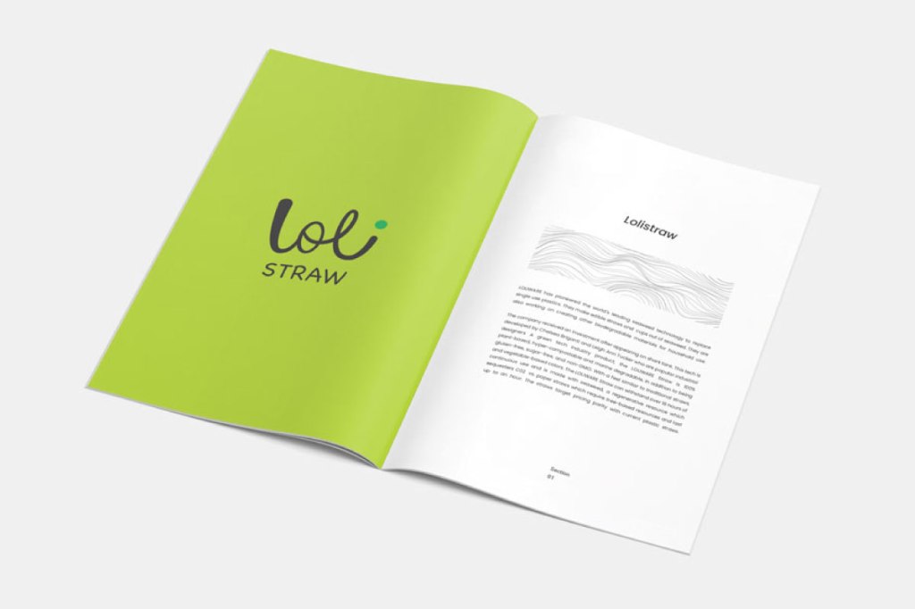
LOLISTRAW
by Loliware
The parent brand ‘Loliware’ has a logo. Lolistraw is the product I decided to design the logo for.
Research
LOLIWARE has pioneered the world’s leading seaweed technology to replace single-use
plastics. They make edible straws and cups out of seaweed. They are also working on creating other biodegradable materials for household use.
The company received investment after appearing on shark tank. This tech is developed by Chelsea Briganti and Leigh Ann Tucker who are industrial designers.
The Product

The Current Logo

-The logo looks nothing like the parent brand. And has no emphasis on green tech.
-The stroke weight of ‘straw’ is too light for some backgrounds.
-The O has too many details that get lost in small sizes.
The New logo


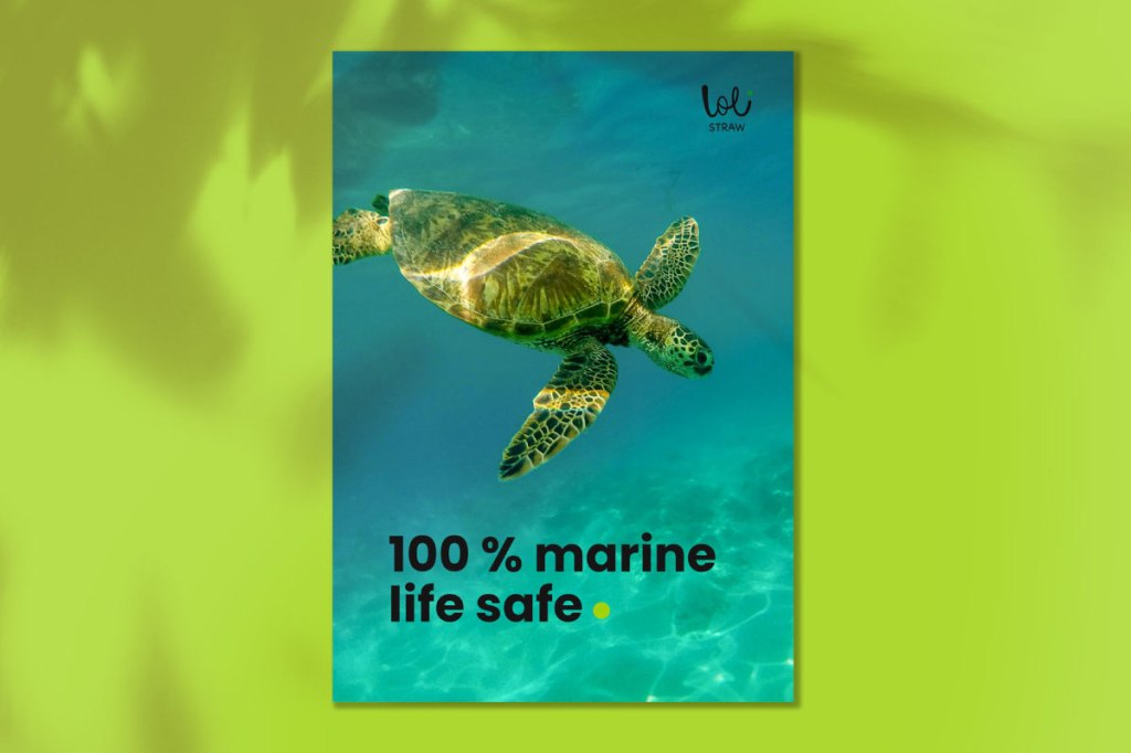
The handwritten font has a loopy feel to it, just like the functionality of the straw. This makes it resonate with the brand. The logo can also be easily used in smaller sizes as it has very few elements. Lolistraw is an eco friendly initiative and it was vital to bring green into the logo to convey this message.
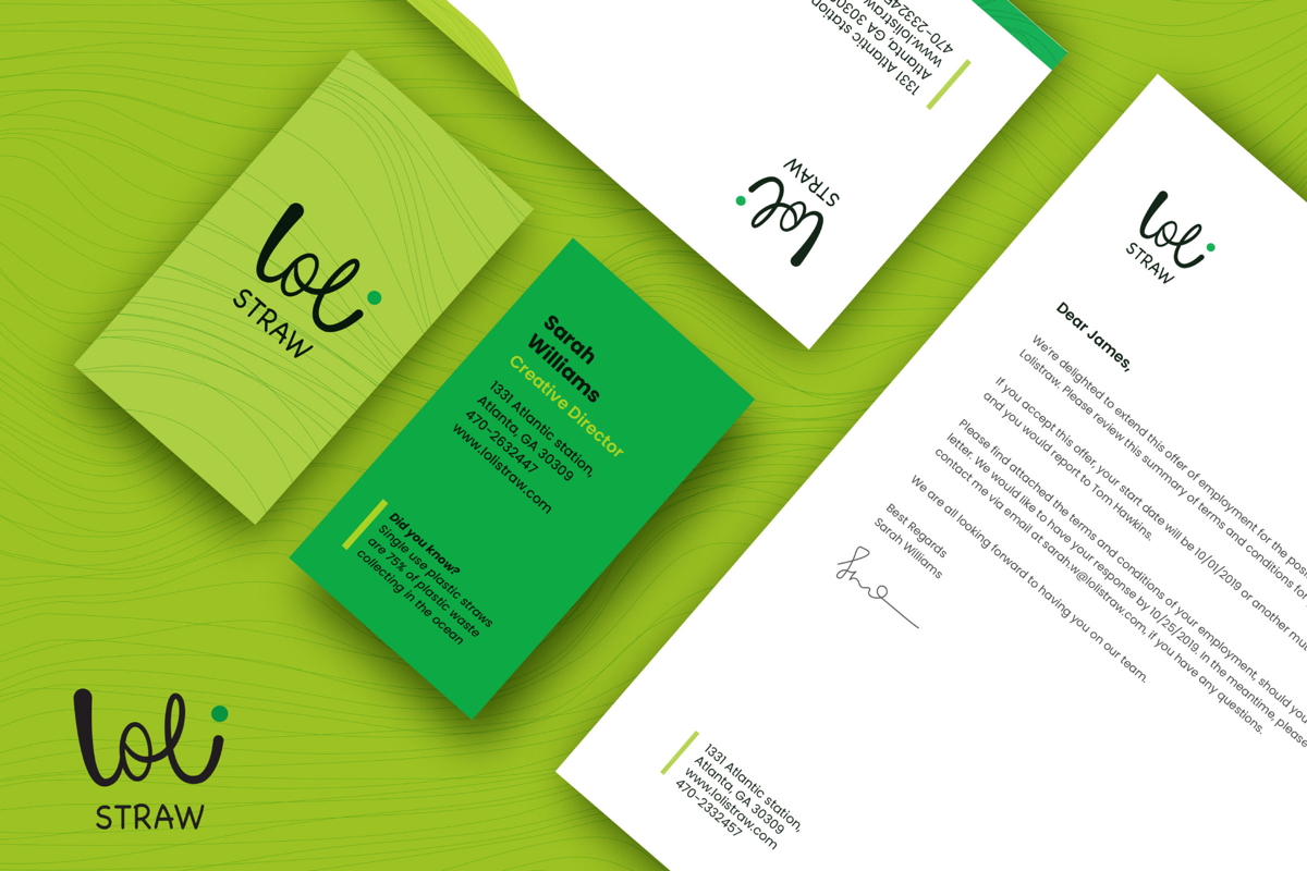
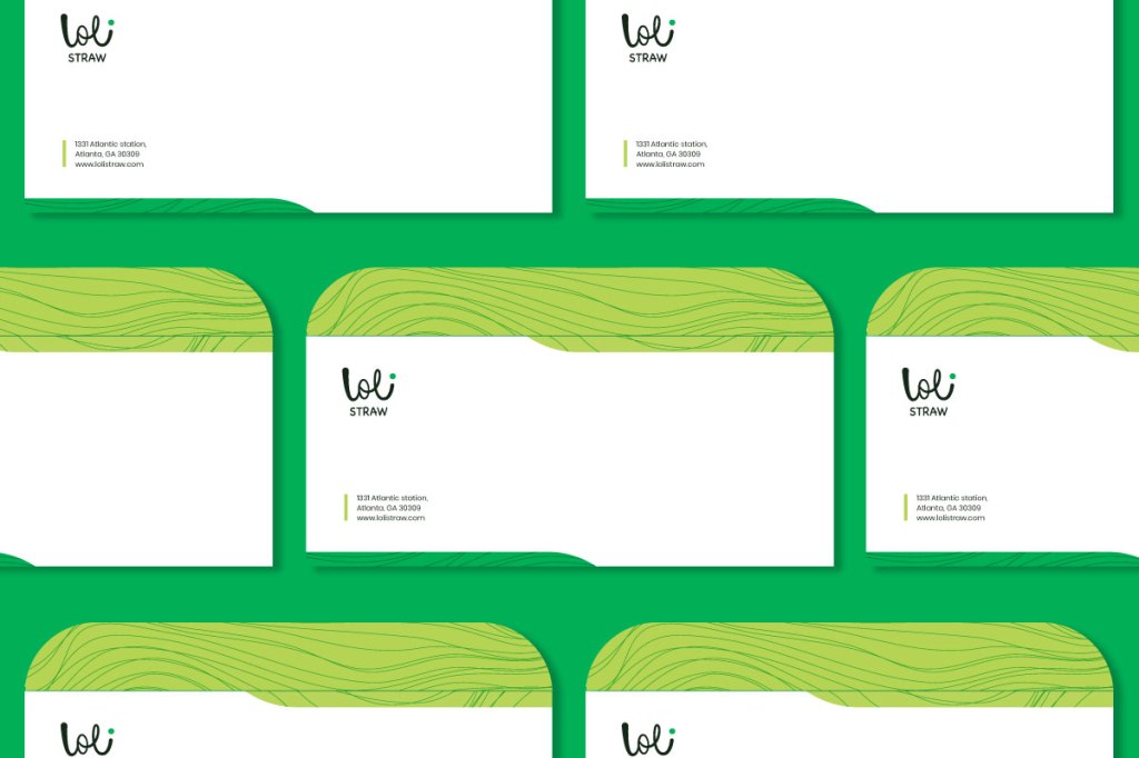
Patterns and Colors


I wanted to have supporting elements for in the brand that would speak to the origin of the product. The seaweed in the basis for the lolistraw and so I incorporated the texture found in the leaves into the branding. In combination with the green background it would help the colours of the brand pop out.
Usage


Thank you:)
